
MERAL ZAHID

MIX MEDIA EFFECT
Mix media animation is an effect created using multiple mediums to create an illusion of a motion picture. The idea to create this effect stemmed from the day I watched A-ha Take on Me MV on multimedia in our regular Friday media class. I wanted to incorporate it in our film opening to make it more creative and fun to view.
animating on iPad could have been easier, but I decided to use the traditional paper media for our mixed media effect to create a unique stop-motion effect. I was going back to the basics of animation and its originating mediums to pay respect to the origin of the style. With everything being replaced digitally, I wanted to create art with a simple pen to paper and let creativity take over.
The ultimate indie approach to making music video, never do what anyone expects you to with your DIY skills
For implementation of the idea, I chose this one from the multiple clips we shot as it was simple, clean and straightforward, with quick movement, ensuring no wasted seconds. I edited the clip slightly in VSDC, making it Black and white and increasing contrast. A subtle blur was also added, though barely susceptible. I used the ezgif frame website to extract the images from the video at a set interval and imported them into Canva with four frames on each page. A total of 11 pages were printed for this mini project. This was the group's response to the clip.

After printing out the pages, I labelled each frame in order. Some of them taking me more time than others. In the end I scanned each frame, that totaled to a total of 59 frames on CamScanner and simply imported them to my editing app on the phone Inshot and changed clip duration to 0.1sec and selected the apply to all feature.


Let me introduce my favourite ones.
These two connected frame storyline seemed cool to execute showing a toxic person in a relationship symbolised using a snake.


For this frame I got inspiration from a pinterest pin, I wanted to show a more comic look and add it to try and break the monotony of the other frames

The red in the film opening has been used to symbolise the danger and hurt caused due to the toxicity of the relationship and so the frame shows how it feels as if the darkness is engulfing you when your hurt


Continuing the tangled mess of person look in the mix media footage to show that the person is still tangled up in the feelings for the toxic person. The constant guilt and rethinking if they were in the wrong.

The checkered dress symbolizes that the person feels incomplete, merely a broken half. The eyes amplify the feeling of loneliness, like everyone is waiting to watch you break down creating this suffocation effect. It also symbolises the constant judgment from society that revolves around the LGBTQ+ community.


Final Product
Preliminary Task: Making Memories
On the second day of the shoot, Noor was running late, so I edited the footage on VSDC to create a quick memories montage using the clips from the first day of the shoot. This gave me creative freedom to use the assets I had downloaded all these many years ago, including light leaks (28FREE_BURNS, which I have no idea where I downloaded from), overlays (aka tons of 8mm frames variation), and a variety of LUTs. Here is a peek into the assets I have collected thus far.

I first messed around with some copyright-free footage I found on YouTube many months ago. Inspired by the 8mm film look, I edited the footage which turned out like this.
Since I really like it's visual, I edited the scene from the memories following the same format

List of assests used
To add the light leak effect, I added the effect onto a layer above the footage and changed the overlay mode from bland to Lighten.


For the colour grade, I added the Filmish LUT I had previously custom-created on Resolve for a personal project. Aside from the lut, I only adjusted the highlights and shadows using the colour curve and slowed down each clip to 60 percent of original.
Just like that, we are done with our preliminary task and ready for the memories projection shoot.

Editing was pretty straightforward since I had my shot list for reference, but I followed the structure. I deviated from the plan in the rough cut, considering what looked better while editing and what didn't work.
Strategically, since we had not filmed the opening sequence, I left the first 30 seconds of the audio empty. I then converted all clips from MOV to DNxHD 1080 using an Easefab video converter and imported them directly into Davinci. In the import files tab, I deliberately chose to create media pool bins to categorise them inside the software, enhancing the efficiency of my workflow. This categorisation kept my footage well-organised, enabling me to access it quickly under the labels.


The title cards were a little tricky since we couldn't get a perfect shot despite multiple attempts, so I had to resort to a port-production masking tool to create a fake spotlight effect on the card, including the top. This clip took me the most nodes to perfect since I needed a circular mask to ensure the rest of the screen was dark using the shadows picker, another curve mask to create the fake spotlight at the top of the card, and our classic correction and grade nodes. I also utilised the retime feature to speed up the footage to the point where the camera captures the card entirely in focus.
Towards the end of the MV, I used the reverse clip feature in the video change speed tab to reverse the clips as planned. I also experimented with overlaying three clips to create a chaotic effect. Also, I tried out different grading settings on the projector clips to see if I could make a graphic effect with harsh contrast between the red and white.

MASKING THE IMPERFECTIONS
I used multiple masks on this clip to create a fake spotlight effect. The first node adds a light to the the top of the card as well so that it is also equally visible with the rest of the card, followed by a color correction node on entire clip. The third node uses a cirular window to emphasis the spotlight effect by increasing contrast outside it. The final node gain is taken down to 0.5 percent to grade the footage slightly.
ROUGH CUT
The rough cut took me 2 hours from start to export. The majority of time was consumed by colour grading each footage as the projector colour appeared different on camera, so I created a colour correction node and another colour grading node. I couldn't find any tutorial on fixing the footage, so I played around with the highlights and hue saturation curves to achieve the look of red light projection.

ROUGH CUT 2.0
As soon as I recieved the opening shot footage of the tv under street lamp, I started working my way through to find the shots that I needed. After selecting them I imported them the timeline but I only had 20 sec footage for a 35 second opening gap that I had anticipated would be enough. So I then created a green screen on one of the tv clips shots using window tool in color grading since using fusion feature on my laptop was not an option.


I used a not-so professional version of green screening the clip by first creating a pink screen (so technically not a green screen) to apply Darker Color to it with the selected clip under it.

and just while updating Zahra about the progress, my worst nightmare came true as I lost progress of the first attempt at creating this effect so had to recreate it from scratch.

With much rage at my laptop, I shut it down and picked up the edit the next day so that I wouldn't have a mental breakdown.

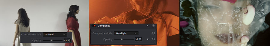
After re-editing the part, I made sure to save the project at each step. Adding a film burn from the free film burn assests that I have and changing the composite to Difference along with lowering the opacity. After finishing with this clip, there was still a 5 second gap between the opening and the rough cut 1.0.


I felt that for the amount of effort that went into the mix media effect, It did not get the screentime it deserved yet and if I simply repeated the clip in the start, it would seem to redundant. Thus, using the wide array of tools available to me I started adding effects to the clip to create this digital design graphic look by first color grading the footage hue to be blue and then applying the difference composite mode with red screen underneath it. Another one of my experimentational effect which turned out fittingly making the clip look a lot more vibrant I added it to the timeline with a fade in start and end of clip so it may smoothly playout overall.

Here is a the timeline after adding the opening footage and further cleaning the footage by using transform tools to remove any unnecessary detail such as the corners of whiteboard visible etc.
Was Rough Cut 2.0 all that I expected?
After finishing the rough cut, I soon realised that the music video's duration was relatively shorter than the conventional music videos, as also pointed out by our media teacher, which, despite being uncommon, is not unheard of. For example, Mitski's - A Pearl, JVKE's - This Is What Falling in Love Feels Like, and Beabadoobee's - Glue Song all fall under the range of 2-minute 30-second music videos.
Finishing Touches


After collecting feedback from the team and our teacher, the main problems to be addressed were the speed of certain clips was a little fast than what we intended and the total duration of our music video was quite short compared to industry standard legnth of videos ranging from 2 min 15 sec onwards.
So I started of from adressing the more easy fix of slowing down the clips to fit better with the music.


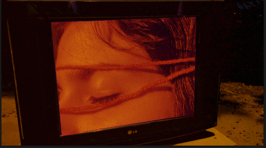
Next on my hit list was trying to fix the suffocation shot that all of us entirely hated. It didn't look visually appealing or match with the aesthetic of the MV so I decided to throw it out the window and replace it with a clip of Zahra's face wrapped in red string. Along with that I added the 'The End Of The F***ing World' card for the act three where initially I accidently added a dupilicate of the act two card 'The Space In Between'.


Using the opening shot and reversing it, I created the ending as a bookend that really encapsulates the entire narrative within it.

In the opening I also added another light leak with lighten mode, to improve the transition from the black curtains to the opening scene.

With that I was done with editing. I screen recorded the whole process which I have sped up in th video below.
A visual representation of me trying to edit this music video to perfection for the past week, instead of studying for my other subjects.
Reflecting upon the final cut, the issue with the green screen clip is that I could not accurately create a green screen layer due to the limitations of my laptop and my refusal to use any other software. Still, I could have improved that clip to be neater without having to care about layer a red screen under it if I had, instead of using experimentation, taken a more conventional approach and just used Canva software to create a green screen and then layer it on using Chroma Key effect on VSDC, thus it would have given a more professional look. However, I was assured that it wasn’t noticeable, but it still bugs me.