MERAL ZAHID

PLANNING PANEL
After hours of research, we finally moved on to the planning phase. Capturing every part of the process, from brainstorming to getting ready for the shoot day and everything in between.


The Trio that survived AS Media
I started the school year by continuing this portfolio with my AS media group since teamwork is a vital part of ensuring the success of our project. This time around since we have Noor with us from the start, we can expect more variation of ideas from her and her artistic input, Zahra for planning out our shoot and me to be once again the editor/Videographer and the mom of the group keep everyone on a schedule.
Knowing my teammates already, it was relieving to know if they would trust me on my vision and give me their honest feedback. We already have a good workflow divide according to our strengths in each area making our team more efficient than before, and ensuring we put forward our best work this year.

Division of tasks
To avoid conflict in post-division, I created this notion database to divide each task among the three of us in the following categories: secondary research, planning, production, and ancillary tasks. After the division, I created a filtered view for each team member so that it may be easier for us to keep track of our posts without being obstructed by extra stuff. This database was beneficial in the accountability of each member, so the hours spent on creating it were not wasted.
The separate view for members is not visible in this embedded link. However, you can view it here:
Brainstorming Ideas
The Idea Reaper (Aka me) demanded that my team members create a presentation to present our ideas to each other after we had them a little thought out so we wouldn't end up pulling threads out of thin air. We all know how that goes for A-level's students with their mid terms and SAT approaching. So, we sat down and had a proper meeting in which we ideated and Noor made up for not being present in the meeting through texting us her Ideas contribution.
Song Selection
In choosing the song, we had to be strategic as it needed to complement the ideas we had come up with in our meeting. Kleptomania Crow had its designated idea, whereas we associated the loneliness with Scott Street and the nostalgia with anything by Adriane Lenker. This way, we narrowed our list to these three songs. However, we continued searching for a song with polysemic lyrics on which we could base our music video to be conceptual as it would not limit us to a particular narrative and overall theme of the song; instead, it would give us a little leeway to be more creative.
Anything by Adrianne Lenker song has this sweet melody, mentioning small moments the artist wants to forget and spend time with her loved one. As she said in a Genius interview, "It’s a montage of many different images that I had stored in my mind from being with this person. I guess there’s a thread of sweetness through it all, through things as intense". Thus, it fits quite perfectly with our nostalgic idea of exploring one old home full of memories.
Kleptomania Crow is another folk-infused song that uses narrative lyricism to symbolically convey a story in which the crow represents a person draining your energy, stealing your precious jewels as it flies away and you remain dead. It is how some people make you feel empty and drained, and so I paired this song with our fantasy idea since the tone of the song matches folk storytelling.
On the recommendation of Noor, we finally found "Outro" by M83. We did not want the song we chose to have a music video already so that it would not affect our creative abilities in constantly comparing ourselves with it. Yet, since the music video differed from our plan, it didn't matter.
Lyrical Interpretation
Zahra Aslaam
Concept Development
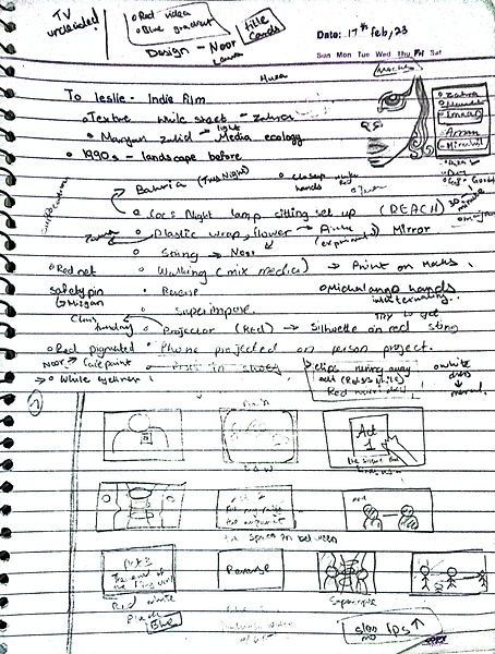

This random page in my media notebook became the key to our final idea as I finally had a eureka moment during one of our many videocalls on google meet.
Developing on Noor's concept of using safety pins and net to show a persons connection with their younger self, I suggested we change it to represent a relationship instead. With each successive clip showing the pins open symbolism the growing distance in the relation.
This became the starting point of then playing around with the idea in my head till I finally put it into order making a quick story board.
The music video would be a conceptual narrative captivating the feelings of losing a relationship whilst representing a saphic East Asian couple. The MV would be a hybrid, both conceptual and narrative thus breaking boundaries of conventional MVs as well as paying homage to the origins of cinema with title cards in early silent films which inspired us to include them in as introduction to the linear structure of the music video.
For the execution of the title cards, we took inspiration from this Instagram post.
Here is an overview of the structure for the shots I wanted which I texted the group. I later on created the shot list using these notes as a guide.
order of shots
1. Night lamp set up
2. Rushed memories projection
Repeat below for two acts
3. Act 1
4. net shot
5. suffocation wrap
6. hands together (replace w michalanglo hands for second act)
7. string
Third act
13. title card
14. string reaching up
15. Reverse all
16. together + far apart + a little apart (quick shots)
17. Put you head on my shoulder shot?
Final Concept
Here is a quick idea pitch version which would be used to present the idea to our record label so that they may approve of it.
A girl blinded by her past relationship attempts to break free. She is tangled in this red string throughout the video until the end when it finally starts unravelling. Throughout the video, the audience watches her descend into chaos with each proceeding act; she attempts to hold on to her lover, reaching out, unable to give up the relationship, struggling to assert her identity while being surrounded by the constant judgment of society and her thoughts and feelings hollowing her inside. The video is open-ended with the polysemic interpretations that could be made from the abstract imagery as we reverse back to act one, showing the never-ending loop of making the same choices and the cycle of heartbreak, giving the message that to protect ourselves from being taken advantage of and hurting we must learn to change.

We pitched the Idea to our media teacher to get hist take on it, and he gave us the green light meaning we could start working on the official shoot day planning.
Acquiring permission for music
Mute Records, a child company of BMG, represents M83. When I tried looking for contact on the M83 official website and Mute Records regarding permission to use and could not find any, I went on the BMG website, where I found the form requesting song usage for a film but not music videos. Thus, I emailed directly to the address given on-site: licensing@bmg.com.
The email I sent is attached here below. Hopefully, they get back to us in time.


MOODBOARD
I created this mood board while on the video call with my teammates presenting my idea, scrolling through Pinterest like a maniac to convey the visuals I have in mind for it till my for you page became somewhat concerning with an insane amount of red and black-themed images in the feed. However, the curated content allowed me to take inspiration from it when at a loss for some, especially during creating the frames for animation. It is a reflection of our final product as we were heavily inspired from it for our visuals.
Shot-List
After the clear-cut planning and our final idea in mind, the shot list didn't take me much time to make. It provided the exact shots I needed and the order I wanted them to appear in the Music video, though later on, I did end up deviating slightly from the plan by experimenting with mix-media effects and adding some additional shots to fit in context with the music video without it seeming too redundant.
The shot list features the type of shot needed for each location, such as for our shoot at night under the street lamp, which required four shots, including Dolly on TV and a long shot of the area. This shot would be repeated for one with and one without a person. The specificity helped maintain the focus during long shooting days and ultimately aided my teammates when I could not make it to the shoot due to an emergency.
Here is the link to the shot list:
https://docs.google.com/spreadsheets/d/1_xNxm9Gi6Ljk6YTdC2MmXSPbxZC82P55vF3s8zRV-gw/edit?usp=sharing
Storyboard
Noor Ul Emaan
Budget
Zahra Aslaam
Equipment
Zahra Aslaam
Risk Assesment
Zahra Aslaam
Creating Our label
Before riding the thought train, it was only sensible to first research indie record label names and how the creator came up with them. While researching, I faced many difficulties as there was insufficient information about the topic on many record labels, so I have only discussed a select few labels I could find.
Mitski, an artist I have mentioned for the millionth time thus far, has been signed with an independent record label, Dead Oceans. The label's name came from the lyrics of Bob Dylan's "A Hard Rain's a-Gonna Fall", adding an element of intertextuality by cross-referencing a popular existing piece of work.
Another popular Indie band, Artic Monkeys, and our favourite weird indie band, Superorganism, are signed with the British label Domino Recordings. There is little information as to the name of the label, so it is, by symbolism, referring to creating change through the power of music, or I'm thinking too deeply, and it's just supposed to sound cool.
4AD, with the band Bon Iver, was initially named Axis Records. However, with the release of their first four singles, when another label with the same name started publishing songs, they changed it to 4AD as an abbreviation of the word forward. Thus, The name was made uniquely identifiable so that the label could be easily distinguished from its competitors. Other names that they considered included 1980AD, 4WD, and 1984. One of the options, 1984, is a reference to George Orwell's 1984 dystopian war novel (that is currently sitting on my bedroom shelf awaiting when I will find the time to read it); this intertextual reference is easy to spot by highlighting a book that had been banned due to its controversial content which might allude to the fact that the label is open to the freedom of speech of its artist as an indie label.
Mom + Pop music record label, with new artists like Maya Hawke under their wing, originally started in 2008 in New York with the founder, Michael Goldstone, coming up with 56 possibilities of finally sticking with the last one. As mentioned on the label's website, "55 of which were New York-centric, inspired by 4th & B'way Records." this shows the inspiration derived from his surroundings and the existing label; however, the chosen name is idiosyncratic in comparison, it stands out and would in no way be confused with any other existing label serving its purpose of standing out from the crowd.
Lastly, Until it was sold to PolyGram in 1989, Island Records was the largest indie record label in history, with its name inspired by the Harry Belafonte song "Island in the Sun". It looks like we have again got a classic case of intertextuality on our hands.
After going through the list of all these labels, a trend emerged. Most labels have names meaningful to the founders, often shown with intertextual reference. It is also identifiable and unique, so it isn't mistaken for another record. Considering this, I devised a few variations of our label. Inspired by Taylor Swift's tenth-studio album, Midnight Records subtly alludes to my obsession with her recent work, including Folklore and Evermore.
Evergreen Records directly refers to the song "Evergreen" by Richy Mitch and the Coal Miners, which has only eight lyrics throughout the song. Yet, it makes you feel like anything is possible, that you must only be ready to start your journey. It is a song that speaks directly to me so that I might be slightly biased toward this option. The last few potential label names include Spades Records, which could easily have a cool spade image label logo, which is distinct and easily identifiable if the motif is used. Else, we have Teardrop Records and Mirrorball Records.


Designing the label logo
To expand my skills beyond Canva, I opted for a more professional environment for designing our label logo. After researching software to illustrate logos, I debated between Figma and Adobe Illustrator, which give way more flexibility in design customisation. Trying to follow industry standards, I worked on Adobe Illustrator to create our logo.


FINAL LOGO
I texted both logo versions to my teammates, and Noor pointed out that the right one looked a little 'wonky'. It was intentional, but it seem a little abrupt on the contrast at the edges, so I am taking her word for it. We decided to finalise the simpler version. I have implemented a stylistic font as seen in the 4AD label logo, and it uses the actual symbolic representation of spades record just like for Dead oceans and Island record.

Getting a little carried away with designing, I ended up creating a branding logo for myself which turned out really cute. So, here is an overview of the design and why I made it, and it follows a blue color palette since it's one of my favourite colors.

Artist
Noor Ul Emaan
Casting
Zahra Aslaam
Creating the title cards
To execute the title frame idea, creating introductory clips for each act displaying title cards first required us to make the cards. The task of creating cards was assigned to Noor, yet my graphic design itch took over after she was done with her draft. I made the cards to have a more modern feel and stylistically used negative space to show the distancing of people in the Act 2 card.
The left shows my final product based on Noor's initial design, which is attached to the right.
We took inspiration from book titles and other media forms for the title cards. It allowed us to create intertextual references to relevant media. For example, the titles we short-listed included The Silence That Binds Us, which refers to a 'YA contemporary novel about a Chinese Taiwanese American teenager whose family deals with grief and the underlying racism they must face when tragedy strikes and unsettles an entire community.' We felt it resonated with our idea of representation of not being accepted by society.